Couture · the identity
A luxury fashion magazine
Black, space, few words, gold detail. Website, LinkedIn, case studies, portraits and closers.
The diegonmtz System · v1.2.0
Serious frame, playful mouth.
One brand, three books: Brand, Web and Motion. Everything I make, from this site to a fifteen-second story, is built from the pieces on this page. The values come straight from the same token file the site uses.
[ 01 · PRINCIPLES ]
Couture · the identity
Black, space, few words, gold detail. Website, LinkedIn, case studies, portraits and closers.
Archivo · the lens
White walls, frames, gallery labels. Culture, travel, museums, events and behind the scenes.
Voice · the fun
Humor never comes from playful visuals. It comes from what I say: captions, subtitles, talking to camera.
[ 02 · PERSONALITY ]
The image stays elegant everywhere, social included. The fun never comes from the visuals; it comes from what I say. The contrast between the two is the brand.
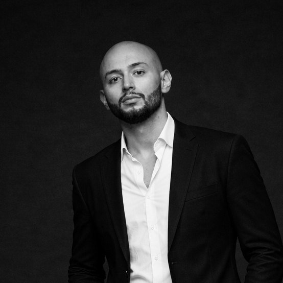
The frame
Black, space, one hard light, a still pose. It could hang in a gallery.
The mouth
A line that makes you smile. Short, sharp, written natively in Spanish and English.
[ 03 · IDENTITY ]
The D is the brand. It signs everything outside the interface: avatar, favicon, video intro, slides, email and print. The names come second: Diego Núñez in Cinzel next to the D in Couture pieces, and the wordmark, alone, for the interface.
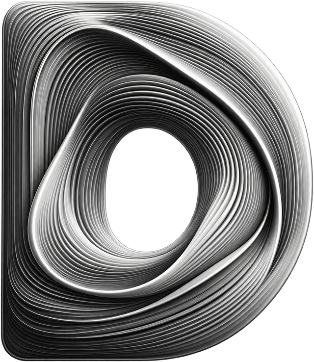
logo-layers.svg · logo-4k.png · logo-2k.png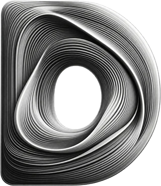 Diego Núñez
There is only the full-tone D. No flat, outline or one-color version: the D is the ribbons. Where they can’t survive, the wordmark takes its place.
One wordmark: DIEGONMTZ in Cinzel Decorative 400, wide tracking. It signs the interface, and it stands in for the D wherever the ribbons can’t survive: embroidery, engraving, a stamp, one-color print, anything under 32 px. The Space Mono wordmark belonged to the old system and is retired.
How a piece signs off. The bigger the piece, the more of the signature it carries.
Diego Núñez
AI-native product manager
Let’s build something clear, useful, and hard to ignore.
diegonmtz.com
Diego Núñez
AI-native product manager
diegonmtz.com
Keep a margin equal to the counter, the hole inside the D, on every side. Nothing enters it: no text, no greca, no edge of the frame.
diegonmtz Design System | diegoNMTZ
Videos can open with the D: the official intro is style F · Light, a light that travels around the ribbons and turns them on, stepped at 12 fps, then the wordmark revealed in 6 steps.
[ 04 · IMAGE ]
Portraits read like a fashion editorial. High-contrast black and white; the only color allowed is a palette color already in the scene. People stay whole in their own space.
| Framing | Vertical. Full body or three-quarter, with generous negative space above for a title. |
|---|---|
| Light | One hard source at 45°, black seamless. Deep shadows, no fill. |
| Pose | Still. Direct gaze or three-quarter, hands in pockets, chin slightly up. |
| Styling | Black and white, tailored, no logos. At most one object in a palette color: a flower, a pocket square. |
| Grade | Black and white with selective color. Colors outside the palette go to gray. |
| Type on it | In the negative space, never across the face. Name in Cinzel, lines in Newsreader. |

[ 05 · COLOR ]
Black and white carry the page. Pink is the signal, once per piece. Orange is the action. Gold colors the ornament, so it lives in video, print and slides, never on this site. The extended inks are for data, categories and languages, one per piece. Click a swatch to copy it.
Couture proportions: black ~68%, white and gray ~23%, pink ~6%, orange ~2%, gold ~1%. Solid inks only: no tints, no gradients, no green.
[ 06 · TYPE ]
Strike · once per page
--font-strikeCraft
Voice · headings, names
--font-voiceStrategy, tailored.
Voice italic · taglines
--font-voiceLet’s build something clear, useful, and hard to ignore.
Read · body
--font-readProducto con oficio. Less noise, better decisions: a product manager’s job is to make the next decision obvious, then make it again tomorrow with better information.
Read capitals · labels
--font-readAI-native product manager
System · UI, data
--font-systemCase studies · Reports · Nº 01 — ToDoTo
| Style | Family | Web | Video (share of short side) |
|---|---|---|---|
| Strike | "Cinzel Decorative", serif | clamp(2.1rem, 6vw, 4.7rem) | 14 vmin |
| Title L | "Newsreader", serif | clamp(2rem, 4.2vw, 3.4rem) | 6.5 vmin |
| Title M | "Newsreader", serif | 1.48rem | 4.8 vmin |
| Body | "Cormorant Garamond", serif | 1.14rem | 3.6 vmin · subtitles 4.4 |
| Label / system | Read capitals · "Space Mono", monospace | ~0.62–0.66rem | 2.2 vmin |
[ 07 · WEB ]
The components below are the site’s own CSS, not pictures of it. Depth comes from a line, never from a shadow. Buttons never move on hover; only their fill changes. No ornament on the web: the site stays pure line and type.
Buttons
Labels
Product strategy
[ CASE STUDY ]
Card
Report · 2024
Square corners, a 1px line, no shadow.
Text and link
Read the ToDoTo case study for the full story. Focus shows a 2px pink outline.
outline: 2px solid var(--accent), offset 2px.[ 08 · ORNAMENT ]
The ornament took the place of shadows, cutouts and stickers. It frames, divides and signs in video, print and slides. These are specimens: the site itself never uses them.
Greca · Couture
The meander. Video chapters, dividers in slides and print.
Ola · Archivo
The running wave. Above gallery labels, for culture and travel.
Filete · the smallest
One greca unit between two hairlines. The closer’s base line.
chapterCut to black. The title cuts in and a fine gold greca draws underneath in 6 steps.closerThe Couture signature. The name is revealed in 6 steps, then the pink hairline, the role, the tagline, the orange URL and a gold filete.gallery_labelArchivo. A black ola draws above the label, straight on the wall, with no box.[ 09 · MOTION ]
Still by default. Things appear through a mask or a line being drawn, in 4 or 6 steps at 12 fps, then hold. Hard cuts, never a cross-dissolve. Nothing rotates, bounces, shakes, scales or flies in. These clips are rendered by the video kit.
nameA hairline draws in 4 steps, the name cuts in, the role follows 4 frames later.figureThe number in Cinzel is unmasked bottom-up in 6 steps; the label cuts in when it lands.threadThe piece’s one pink: a hairline draws under one word.letterboxBlack bars close in 4 steps to a cinema frame; the line cuts in inside the bottom bar.color_matteThe shot opens in black and white; its palette colors come up in 6 steps and stay.Every hit has a sound on the frame where it lands: a dry click, a shutter, a key, a marker, and a two-bell signature on the closer. All of them are synthesized in code.
[ 10 · VOICE ]
Spanish and English, each written natively; Portuguese in subtitles. Short sentences, one idea per line, confidence without adjectives.
| Spanish | English | |
|---|---|---|
| Bio | Producto con oficio. | Strategy, tailored. |
| CTA | Hablemos. | Let’s talk. |
| Post | Menos ruido. Mejores decisiones. | Less noise. Better decisions. |
| Archivo label | Nº 01 — ToDoTo. Producto en vivo. | Nº 01 — ToDoTo. Live product. |
[ 11 · TOKENS ]
Every value on this page and on the site comes from one file. A build step writes it into the site’s CSS, and a check fails if a brand color is typed by hand anywhere.
| Token | Value | Resolves to |
|---|---|---|
--primary | var(--black) | #000000 |
--bg | var(--white) | #FFFFFF |
--surface | var(--gray) | #F4F4F4 |
--text | var(--black) | #000000 |
--muted | var(--graphite) | #2F2F2F |
--accent | var(--pink) | #FF0088 |
--cta | var(--orange) | #FA8334 |
--line | var(--black) | #000000 |
--space-1 | 4px | |
--space-2 | 8px | |
--space-3 | 12px | |
--space-4 | 16px | |
--space-5 | 24px | |
--space-6 | 32px | |
--space-7 | 48px | |
--space-8 | 64px | |
--space-9 | 96px | |
--space-10 | 128px | |
--motion-ui | 160ms | |
--motion-ui-fast | 80ms | |
--motion-reveal | 500ms | |
--motion-reveal-steps | 6 | |
sm breakpoint | max-width: 640px | |
md breakpoint | max-width: 780px | |
lg breakpoint | max-width: 900px | |
xl breakpoint | max-width: 1060px | |
Diego Núñez
AI-native product manager
Let’s build something clear, useful, and hard to ignore.
diegonmtz.com